Infographics are big business. You can buy a big glossy book of infographics on more or less any topic, for any age of reader. They appear in magazines, newspapers, websites and on video, where they are sometimes expanded into extraordinary 3D animations. They’ve clearly been around for a while, and I can recall a few examples of those glossy books from the 1980s, but it’s easy to assume that they are something characteristically twenty-first century—something whose ubiquity is peculiar to our current age of reduced attention spans and TLDR. They can, however, be traced back at least as far as the seventeenth century, and by the nineteenth they were widely used—in 1857 Florence Nightingale used them to help persuade Queen Victoria of the need to improve conditions in military hospitals. In 1900, at the Exposition Universelle in Paris, W.E.B. Du Bois mounted an exhibition of over sixty infographics to illustrate the socio-economic conditions experienced by the U.S.A.’s black population, and House of Illustration in London recently displayed reproductions of them, in an exhibition entitled W.E.B. Du Bois: Charting Black Lives.
These painstakingly handmade images, with carefully stencilled lettering and striking graphic design, were intended to counter prevailing racial narratives which constructed black people as lazy, inefficient, child-like creatures, in need of guidance from Europeans. The show’s web-page describes this as a radical new approach to refuting racism, which I guess means it had previously been contested on moral rather than statistical grounds. Here, in numerical data, can be seen the capacity of African-Americans to achieve and maintain prosperity, as well as the stark inequalities that continued (and continue) to separate them from the white population. Using ‘facts’ can still look like a radical intervention, and it has to be said that whenever any privileged group wants to claim an empirical or reasonable justification for their advantages, the simple application of rigorously collected research data is usually all that’s required to make their ideas look pretty silly—in the eyes of those who understand reasoned arguments and empirical data, at least. The function of the infographic is to make those arguments and data available more widely, to those unlikely to pore over densely written texts and columns of figures as well as to the statistically literate.
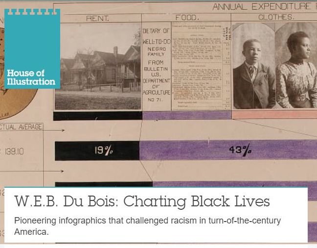
The majority of Du Bois’s charts, which were largely prepared by students from his sociology department at Atlanta University, are fairly dry—soberly labelled three-colour bar graphs and the like. Some of them are a riot, however. When there is an extreme disparity to illustrate, for example, rather than eliding the middle portion of a bar, it may be wrapped into an elaborate spiral that fills the bulk of the sheet. One table showing the ‘income and expenditure of Negro families in Atlanta, GA., U.S.A.’ is a multimedia extravaganza, illustrated with pasted-on photographs and a large graphic of a one dollar coin. These images are the work of someone who understands the value of visual design in communicating a complex point. Du Bois is clearly very well known as a communicator, but not particularly as a visual one, much less a designer, so the material on display here offers an interesting insight into him, as much as the history of visual design.
The sixty-three reproductions are displayed in a fairly small room, in three racks of hinged frames, which can be browsed like gigantic books, sequentially or otherwise. A few text panels and photographs complete the show, as well as a couple of updated versions of the graphics prepared by Mona Chalabi, a statistician who I know from her occasional appearances on Frankie Boyle’s New World Order (where she demonstrates the truth of right-wing claims that statistics are biased in favour of the left—by way of being true). I was slightly confused by her infographics, and I’m not convinced they were labelled completely accurately. The exhibition text is short but informative, and contextualises the graphics effectively without inviting us to see or understand them in a particular way. As an infographic fan, I was in heaven, but these are more than historical documents: they continue to do the work that they were made for, and the show is also the show that Du Bois mounted in Paris one-hundred and twenty years ago. Black lives, as these pioneering Atlanta sociologists charted them, are the real matter of the exhibition, and it is instructive to think of those few black intellectuals trying to clear the fog through which they were seen by the world, and through which the majority of their people still saw themselves. The great tragedy is that the lesson they tried to teach the world in 1901 still largely remains to be learned.
